Basic CSS
Presenter Notes
1. Introduction
| author: | Pierre-Antoine Champin |
|---|---|
| date: | 2012 |
| address: | Département Informatique, IUT Lyon 1 |
Presenter Notes
2. Notion of stylesheet
- CSS stands for Cascading StyleSheet
- A stylesheet defines, for every semantic markup, how it is to be presented
- Ensures consistency across the document
- ... or even the whole website.
Presenter Notes
Specifying a stylesheet in HTML
In the <head> element, either as an external stylesheet:
<head>
  <link rel="stylesheet" type="text/css"
        href="mystyle.css" />
</head>
or as an internal (embeded) stylesheet:
<head>
  <style type="text/css">
    /* your CSS here */
  </style>
</head>
Presenter Notes
Playing around
Have a look at http://champin.net/enseignement/web/styles/ .
- Copy the file sample-html.txt,
- rename it to sample-html.html,
- create a stylesheet named style.css in the same directory,
- and watch the presentation of the HTML file change.
Presenter Notes
3. CSS Rule
- CSS defines presentation in terms of rules
- Typically, a rule has three parts:
- a selector
- an attribute
- an value
em { font-style: italic }
- “Text in the <em> tag should be in italic.”
Presenter Notes
Combining rules (1)
- Several similar rules can coexist:
em   { font-style: italic }
em   { color: blue }
cite { font-style: italic }
cite { color: blue }
Presenter Notes
Combining rules (2)
- Rules can be grouped:
- several selectors, separated by commas (“,”)
- several attribute-value pairs, separated by semicolons (“;”)
em, cite { font-style: italic; color: blue }
- “Text in either the <em> or the <cite> tag should be both in italic and blue.”
Presenter Notes
4. Font attributes
font-style:- normal
- italic
- oblique
font-weight:- normal
- bold
- bolder
- lighter
- or a value between 100 and 900 (400 = normal)
- NB: many fonts only support normal and bold
font-variant:- normal
- small-caps
- NB: small-caps are still smaller than regular caps
- example: Pierre-Antoine Champin
font-family:- (see afterwards)
font-size:- (see afterwards)
Presenter Notes
Specific font families
Either the font must be installed on the system (fragile!), or declared as followed:
@font-face
{
  font-family: MyNiftyFont;
  src: url('http://example.org/nifty-font.ttf'),
       url('http://example.org/nifty-font.eot');
}
Note
It may be necessary to provide the font in several formats in order to maximize compatibility with various browsers.
Presenter Notes
Generic font families
Will work in any browser, but appearance may vary:
- serif
- sans-serif
- cursive
- fantasy
- monospace
Good practice, when using specific fonts, is to provide a generic fallback:
font-family: MyNiftyFont, Times New Roman, serif
Presenter Notes
Font size
Font size is typically represented in points
body { font-size: 12pt ; }
or relatively to the font size of the enclosing element:
h1 { font-size: 150% ; }
CSS also provides a number of other units, either absolute (cm, mm, px...) or relative (em, ex...).
Presenter Notes
5. Text attributes
text-decoration:
- none
- underline
- overline
- line-through
- blink
text-transform:
- none
- capitalize
- uppercase
- lowercase
- NB: uppercase is different from small-caps
text-align:- left
- center
- right
- justify
color:- (see afterwards)
background-color:- (see afterwards)
Presenter Notes
Colors in CSS: RGB

http://commons.wikimedia.org/wiki/File:RGB_illumination.jpg
em { color: #f00 }                 /* #rgb */
em { color: #ff0000 }           /* #rrggbb */
em { color: rgb(255,0,0) }
em { color: rgb(100%, 0%, 0%) }
Presenter Notes
Colors in CSS: other ways
- keywords: black, white, red, green, blue, yellow...
- transparency (alpha): rgba(r,g,b,a) where a variew between 0.0 (invisible) and 1.0 (opaque)
- for more, see http://www.w3.org/TR/css3-color/
Presenter Notes
6. Positioning and size
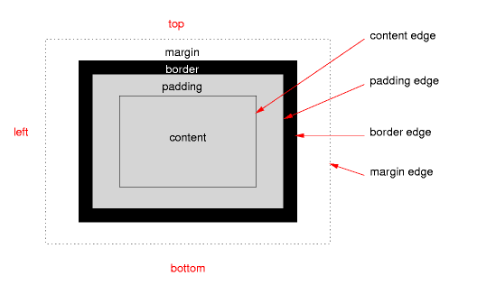
The CSS boxing model:

Presenter Notes
Margin and padding
The margin and padding properties can be used as a shortcut, or their *-top, *-bottom, *-left and *-right variants can be used for more control
p {
  padding: 1em;
  margin-top: 0.5cm ; margin-bottom 0.7cm;
  margin-left: 2cm;  margin-right: 1cm;
}
NB: the em unit equals the current font-size
Presenter Notes
Border
border-width: a length and a unitborder-style:- none
- solid
- dashed
- dotted
- double
- groove
- ridge
- inset
- outset
border-color: a color
The three can also be combined (in that order) withing property border.
border: 1px solid red ;
Presenter Notes
Size
The size of a box can be set with the width and height attribute (using either relative or absolute lengths).
For example, this paragraph has ``width: 50%``, which makes it occupy half of the width of the page.
Sizes can also be more loosely constrained with the min-width, min-height, max-with and max-height attributes.
Presenter Notes
Floating elements
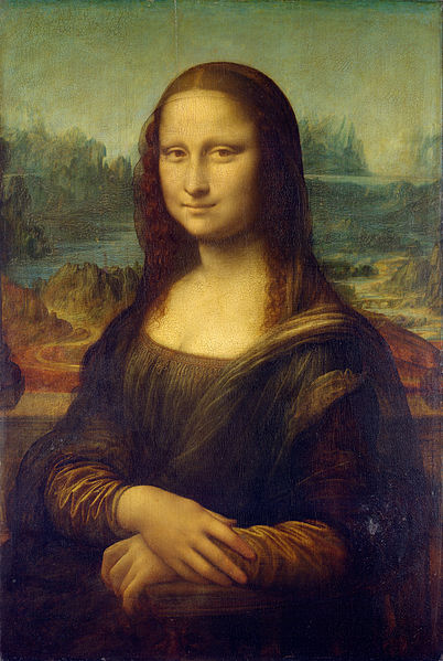
Some images (or inserts)
<img src="img/monalisa.jpg">
are outside the normal flow of text. Instead
they “float” on the right (or left) of the text.
will normaly be rendered as
Some images (or inserts)
 are outside the normal flow of text. Instead
they “float” on the right (or left) of the text.
Presenter Notes
With the following CSS,
img { float: right; /* can also be left */ }
you will get:
Some images (or inserts)
 are outside the normal flow of text. Instead they
“float” on the right (or left) of the text.
Presenter Notes
7. Selectors
More complex selectors can be used to select elements based on their context:
p em { /* applies to any <em> inside a <p>
          — even indirectly */ }

p>em { /* applies to any <em> directly
          inside a <p> */ }

h1+p { /* applies to any <p> directly
          following a <h1> */ }
Presenter Notes
Class and id attributes
HTML allows the class and id attribute on any tag:
- class: a space-separated list of class names
- id: an identifier for the element
<ul id="contents">...</ul>

<p class="summary funny">...</p>
Presenter Notes
Class and id selectors
CSS allows to select elements based on their id or class, even regardless of their tag.
p.summary  { /* any <p> with class 'summary' */ }

.funny     { /* any element with class 'funny' */ }

p#contents { /* the 'contents' element if it is
                a <p> */ }

#contents em { /* any <em> in the 'contents'
                  element */ }
Presenter Notes
Priority
Considering:
em { font-style: italic }

.summary em { font-style: normal;
              font-weight: bold }
How should the following look?
<p class="summary">This summary
is <em>short</em>.</p>
Presenter Notes
Priority (solution)
The HTML in last slide should look like:
This summary is short.
Intuitively, the most specific rules takes precedence here.
CSS priority (“cascading”) rules are complex, but usually match the intuition/intent of the author:
→ (most of the time) they do what one would expect.
Presenter Notes
Pseudo-classes
Pseudo-classes are automatically attached to elements based on some features they have:
a:link    { /* matches any unvisited link */ }

a:visited { /* matches any visited link */ }

:hover    { /* matches any element when the
               mouse pointer is hovering
               on it */ }

li:first-child { /* matches the first <li>
                    of a list */ }

li:last-child { /* can't you guess? */ }
Presenter Notes
Pseudo-elements
Pseudo-elements are parts of a text that is not explicitly tagged, but can be assigned a specific style.
h1:first-letter { /* 1st letter of any <h1> */ }

h1+p:first-line { /* 1st line of any <p>
                     following a <h1> */ }
Presenter Notes
8. En savoir plus
(toutes les pages de ces deux derniers sont des présentations différentes pour le même HTML!)
